
Then I passed it and a bunch of images on to Holly, who knows how to do things like this:
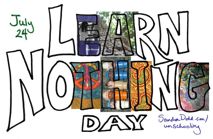
Holly is figuring out which images will go well under what shapes and in what color arrangements. I gave her lots of images and she's going through and choosing what will work on various letter shapes.
The shape of the R, she said, made it more difficult, but she's enjoying the challenge.
I was in watching her resize and then move images around underneath to see that what peeks through the letter is optimal. She showed me one setting that restores the whole images beneath and said I could show you all IF I make clear that it doesn't look like that while she's working on it. She doesn't want anyone to try to learn how from a misleading image, I think. As she's working, all that shows is what's inside the letter, which she has emptied of color (made transparent).
So here's a preview of the art for Learn Nothing Day. When it's finished, you'll be able to print it out to put on your door, or use it small on your calendar or add an icon to your blog or MySpace, if you want. It's been fun.

Art for a newer logo in 2020 (Holly's idea; newer images, better lettering)
Learn Nothing Day page on my site
and at LearnNothingDay.blogspot.com